MAOTAIZI 貓太子
An Owl, Not Cat
是貓頭鷹而不是貓
猫太子作为文具类目少有的新锐品牌,以姿势矫正为核心的头部品牌,自2013年成立以来,始终关注中国青少年儿童的全面健康成长,致力于青少年健康学习用品的研发设计、生产与销售。十年沉淀,猫太子创造性的研发了坐姿矫正器、阅读架、握笔器等一系列姿势矫正类防近视产品,据官方软件生意参谋统计,猫太子已获得连续5年视力保护器销售额第一的好成绩。于此十周年之际,猫太子发布了全新的品牌形象3.0版本,为品牌注入新鲜活力。
全新的品牌标识延续猫头鹰的动物特征,保留原有logo中的头部弧线和底部鸟羽特征,对整体外轮廓重新调整比例和造型,由圆变方,使其视觉感受更加端正,稳重,有力。同时也能更好的融入皇冠造型,直观地将原有logo中缺少的“太子”身份象征表达完整,让整个标识更具识别度和品牌特征,也便于消费者更加直观地将“猫太子”和“猫头鹰太子”关联起来。整个标识中,眼睛部分的结构在原有标识的基础上做了简化,通过更加简洁的图形组合构成了“又圆又大”的猫头鹰眼睛,借助大眼睛的特征向消费者传递猫太子对保护儿童视力健康的重视,并向消费者传达“怕近视就用猫太子”的产品功能价值。
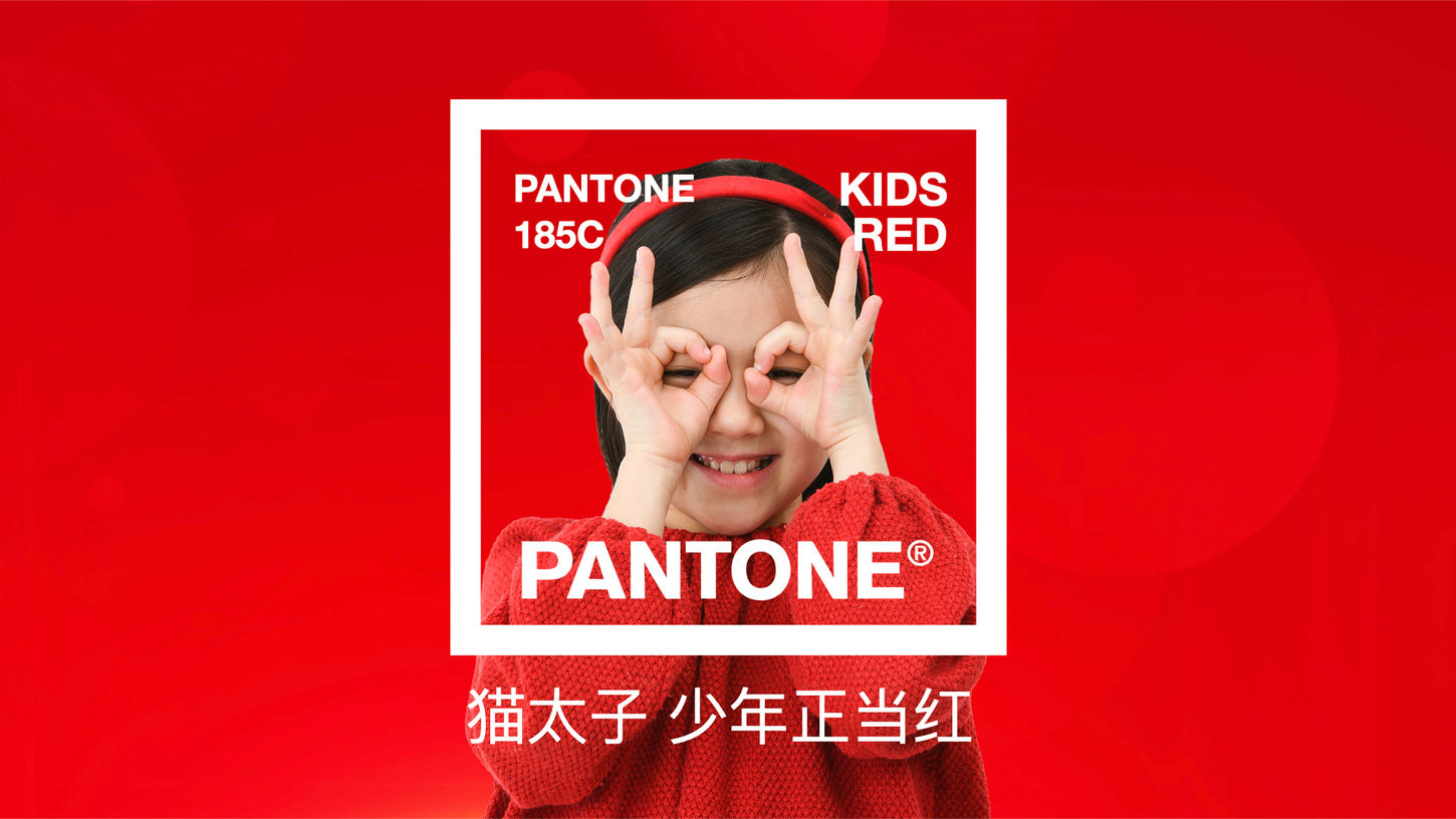
在标识颜色上,将原来的暗红色调整为更加鲜亮醒目的红色,并将其命名为少年红。由此整个品牌从典雅、神秘、沉稳,升级为更加饱满、积极、阳光,给人充满能量的视觉感受,同时契合品牌关注的儿童群体,向消费者传递更加健康、更加正能量的品牌体验。
从猫太子的新logo中,提取出了皇冠与盾牌两个符号,构成了猫太子主要的视觉识别系统。皇冠本身具有太子的身份象征,也有珍贵、优秀的含义,一方面可以表达猫太子研发儿童视力保护产品的专业属性,另一方面更是契合了中国父母望子成龙 ,望女成凤的美好愿望。完整的logo外形剪影构成了猫太子特有的盾牌符号,传达防护、守护的理念,守护中国青少年儿童健康成长,让家长更放心。
As a rare new brand in the stationery category, MAOTAIZI takes posture correction as the core of the head brand, since its establishment in 2013, it has always paid attention to the comprehensive and healthy growth of Chinese teenagers and children, and is committed to the research and development, design, production and sales of adolescent health school supplies. Ten years of precipitations, MAOTAIZI creatively developed a series of posture correction anti-myopia products such as sitting orthotics, reading rack, pen holder, according to the official software business staff statistics, MAOTAIZI has obtained the first sales of vision protectors for five consecutive years. On the occasion of this 10th anniversary, MAOTAIZI released a new brand image version 3.0 to inject fresh vitality into the brand.
The new brand identity continues the animal characteristics of the owl, retains the head arc and the bottom bird feather characteristics of the original logo, and readjusting the proportion and shape of the overall outline, changing from round to square, making its visual experience more correct, stable and powerful. At the same time, it can also better integrate into the crown shape, intuitively express the "prince" status symbol that is missing in the original logo, make the entire logo more recognizable and brand characteristics, and also facilitate consumers to more intuitively associate the "MAOTAIZI" and "Owl Prince". In the entire logo, the structure of the eye part is simplified on the basis of the original logo, and the "round and large" owl eyes are formed through a more concise graphic combination, which conveys to consumers the importance of MAOTAIZI to protect the visual health of children with the characteristics of the big eyes, and conveys to consumers the functional value of the product of "MAOTAIZI for fear of myopia".
In the logo color, the original dark red is adjusted to a more bright and eye-catching red, and it is named juvenile red. As a result, the whole brand has been upgraded from elegant, mysterious and calm to more full, positive and sunny, giving people a visual feeling full of energy, and at the same time, it fits the children group concerned by the brand, and delivers a healthier and more positive brand experience to consumers.
From the new logo of MAOTAIZI, the two symbols of crown and shield are extracted, which constitute the main visual identification system of MAOTAIZI. The crown itself has the status symbol of prince, and also has the meaning of precious and excellent, on the one hand, it can express the professional attributes of MAOTAIZI's research and development of children's vision protection products, on the other hand, it is in line with the good wishes of Chinese parents. The complete logo silhouette forms the unique shield symbol of MAOTAIZI, conveying the concept of protection and protection, protecting the healthy growth of Chinese teenagers and children, and making parents more assured.


